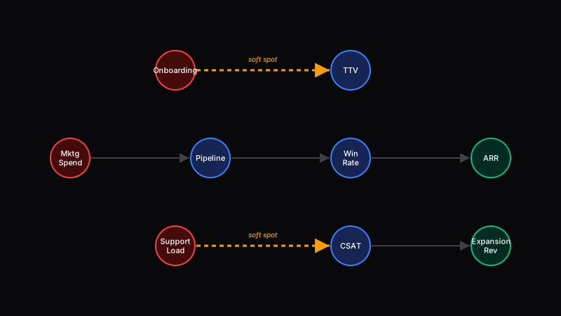
Stop reading your P&L as a list. Read it as a graph and price the leaking edges.
One edge in a retail catalog pipeline carried a high per-unit tariff over millions of units; naming it cut per-unit cost by more than 90%.
Click any node to trace its downstream causal path.
The Model
A node is any line in your P&L that you can measure: a cost center, a revenue line, a conversion metric, a quality score.
An edge is a causal relationship: “onboarding friction delays time to value,” “support load erodes satisfaction,” “pipeline quality drives win rate.” These are not correlations. They are directional causes that propagate through your business.
A soft spot is an edge where value is leaking and no one has named it yet. Every business has them. Most of the time, the people closest to the work already feel them - they just lack the language to surface them to leadership.
Finding Soft Spots
The people closest to the work already know where the soft spots are. They feel them every day. They just lack the vocabulary to name them as edges in a graph that leadership can act on. Three questions surface them:
Where do you lose the most time between receiving an input and producing an output?
Which part of your process exists only because another part fails silently?
If you had to cut one step and absorb the consequences, which step would cause the least damage?
Feed every response into the graph. Map each answer to a node or edge. The soft spots cluster. The highest-value intervention is usually sitting in the intersection of those answers.
Why This Works
Status quo: A couple of key executives intuitively understand where value leaks in the business. They carry the map in their heads. When they leave, the map leaves with them. Most other people describe problems in their own local vocabulary - “onboarding is slow,” “support is overwhelmed” - without connecting those complaints to financial outcomes.
The target state: The graph gives the entire organization a shared language. When anyone - from a frontline rep to a VP - can say “there is a soft spot on the edge between onboarding friction and time to value,” that complaint becomes actionable. It maps to a node. It connects to a dollar amount. It can be prioritized.
The power of the directed graph is not the math. It is the network effect of shared language. Every person who learns to name edges and soft spots becomes a sensor for value leakage. The more people speak the language, the more signal leadership gets, and the faster the organization names the leaks that were hiding in plain sight.
From Graph to Action
Once you find a soft spot, the AI Operations Tools evaluate what to do about it:
Thanks to James Garvey for encouraging me to formalize and publish these frameworks.
Worked example: SKU ingestion at retail scale
In practice, this framework is how you find the mispriced edges. Walk the chart of accounts, look for edges where the implicit per-unit cost is radically higher than it ought to be, and that's where the AI capital is worth deploying.
A concrete example: SKU ingestion in a retail holding company. The edge connecting vendor-provided-data to catalog-ready-SKU carried a high per-unit tariff - a human operator touching each SKU, fixing spec sheets, reconciling attributes. The volume flowing over that edge was in the millions. The total implied cost made the edge one of the most expensive non-revenue-producing lines on the graph.
Deployed: an AI pipeline targeted specifically at that edge. Result: per-unit cost fell by more than 90%. No other edges touched. The framework predicted this ranking; the deployment confirmed it. That is what falsifiable looks like for a framework - the prediction has to match reality or the framework is wrong.
When the graph model fails
The framework rests on a falsifiable claim: the edge with the largest mispricing is the edge where capital deployment produces the largest return. If that ranking is wrong in an environment, the framework is wrong for that environment.
- -Path dependence dominates. If attacking the largest edge requires upstream edges to be fixed first, the ranking lies about true leverage. Walk topologically, not just by magnitude.
- -The graph is wrong. If the chart of accounts hides the real causal structure (e.g., an activity-based cost is smeared across three GL lines), the edges are fiction. Rebuild the graph before ranking.
- -The mispriced edge is mispriced for a reason. Regulatory, contractual, or political constraints can make an edge untouchable. Kill it from the candidate set rather than ranking it.
- -Correlated rework. Fixing one edge can inflate adjacent edges (the classic "squeeze the balloon" problem). Score the neighborhood, not the single edge.
Rosetta Stone
Four circles, four readings of the same object. Each role reads the artifact through its own lens.
The chart of accounts is a first-order approximation of your portfolio of operating investments. Each edge has a risk-adjusted return you can estimate or compute. The graph is the map of deployable capital.
A way to make the team's felt knowledge legible. Everyone knows where the bottlenecks are; the graph gives them names and a place on the wall. An audit trail of where value moves and where it stalls.
A system diagram for the business. Nodes are services, edges are dependencies. The failing edges are where you should put your next PR.
A directed graph G=(V,E) of operating flows. The allocation problem is a vertex-weighted max-flow variant: select the edge improvements that maximize expected value under budget and correlation constraints.